How to Make Fan Comics
People like to pay tribute to the loveable pink puff in many ways. One way is by giving the great glutton a series of new, visual adventures in comic form. Sadly, many fail to obey some pretty clear rules. Whether by hand or composed on a computer, there's some do's and don'ts. Let's take a look at some things that pertain to the actual comic construction.
- Use image editing software to arrange, modify, or what have you. GIMP is open source and can be downloaded for free. You have no excuses.
- Cut back on dead space. Fill up or crop out empty spots, but don't go to the point of crowding.
- Don't make the comics too large. The largest dimension should be around 1000px.
- Save the files as either a GIF or JPG. BMP or some other bizzare format will not be accepted. There's no reason to save as a PNG since there should be no where near that much color information.
- Use an easy to read font that shows well. Even if hand drawn, there's no reason you can't type in the words. Arrange the speech so it is clear who is speaking.
That's how to actually construct the comic, but there's the equally vital trends of what to fill it with:
- The comics should be about Kirby and/or Kirby characters. Sure, characters from other game series and even fan characters can appear, but they shouldn't be the main focus.
- Make something happen. Don't have a lot of dead air or inactivity. Make events occur. Don't waste the reader's time.
- Completely pointless, "random" stupid comics that have no connection to anything that don't even parody Dream Land are not what should be made.
- Before going gung-ho, try a small batch of comics (under five, probably one or two) and see if your material is acceptable for posting on KRR. I don't want you to make twenty-some comics only to be told "No, try again".
- And, most importantly, just because you want to make a comic doesn't mean you should. Especially if a continuing series is in mind, they are a lot of effort. Practice drawing or arranging pictures first, getting the basics down, then try your hand at comicking.
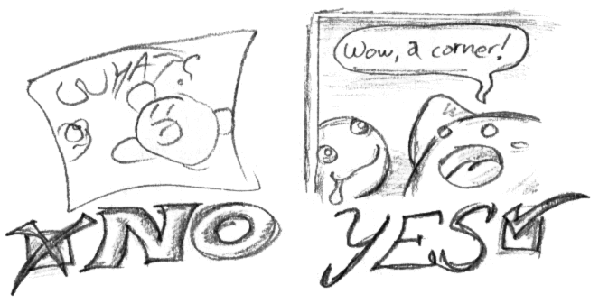
When drawing a comic, with a pencil or a mouse, quality is key. It doesn't have to professional level, but it should at least look like it wasn't made for a grade school art project. Try to have clean, crisp, and straight lines. Don't smudge the pencil or ink. And remember: just because it's being drawn doesn't mean you can't use a computer to clean-up or clear-up the picture.

- Draw like you aren't a seven year old, please. Don't just have wide circles make up kirby. Try to connect the lines.
- Don't use a circle tool to make Kirby's body. If you're riding that crutch, you should work on your fundamentals more.
- Use a ruler. The panels should be nice and square. There's no reason that you should be free-handing these lines.
- Try to have the lines dark. Adjust the contrast digitally, ink over the pencil, or do both.
- Don't draw on lined or colored paper. That just looks tacky. Use blank, white paper.
- Have it look nice. Don't have it be all sloppy an' stuff.
Examples of good drawn comics include:
- Kirazy's Komic, drawn digitally with a tablet.
- Bimblesnaff's Comics, drawn with ink and pencil since there are so few other examples of such.
A sprite comic is the general route taken by those who can't draw well enough or lack the means to digitize their drawings. Since one third of the comic is done for you, the images, that means you better be pulling your weight for the last two legs of the comic -- composition and content. The comic should be arrange well, using a diversity of sprites, backgrounds, and positioning. There should be dynamic or entertaining event transpiring. There should not just be a Kirby sprite who has the artist's name talking about how it's in a comic. That's every other failure of a sprite comic out there.
- Use backgrounds. They are provided just like the sprites. Use them.
- Scale the sprites. Nothing shows a lack of effort more than using the sprites as they are provided. Typically, this is very small.
- Use a variety of positions. Just because every panel can be copied and pasted doesn't mean you should. Kirby has hundreds of positions. Choose different ones to show action or progress between the panels.
- Don't cheesily edit on lines or effects. Try to either match the pixels or at least not free-hand draw them.
- Use sprites from the same games. Don't have 16-bit mixed in with 32-bit.
Examples of great sprite comics include:
These guidelines aren't meant to be cruel. The better content that exists on KRR, the better the site will look to the passers-by. For the longest time, people regarded the whole of the fan comics as a haven of garbage that rubbish and nonsense was thrown into. A few good artists was all it took to challenge that long standing opinion. The better everything looks means a healthier, better future for fan comics. Help us raise the bar.